The Portland Fire sped up the process as the WNBA released its schedule for the 2026 season. The franchise already stacked its support and coaching staff with experienced individuals. WNBA legend Sylvia Fowles joins the side as assistant coach.
While the season starts on May 9, the franchise is looking to shortlist its players for the expansion draft and the free agency. Amid this, the front office released the official Jersey for the side.
Fans React To Portland Fire’s Jersey
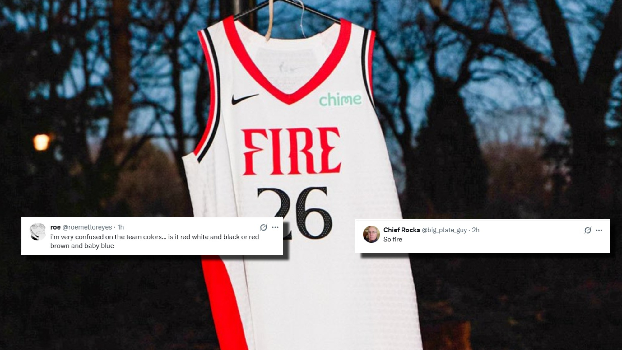
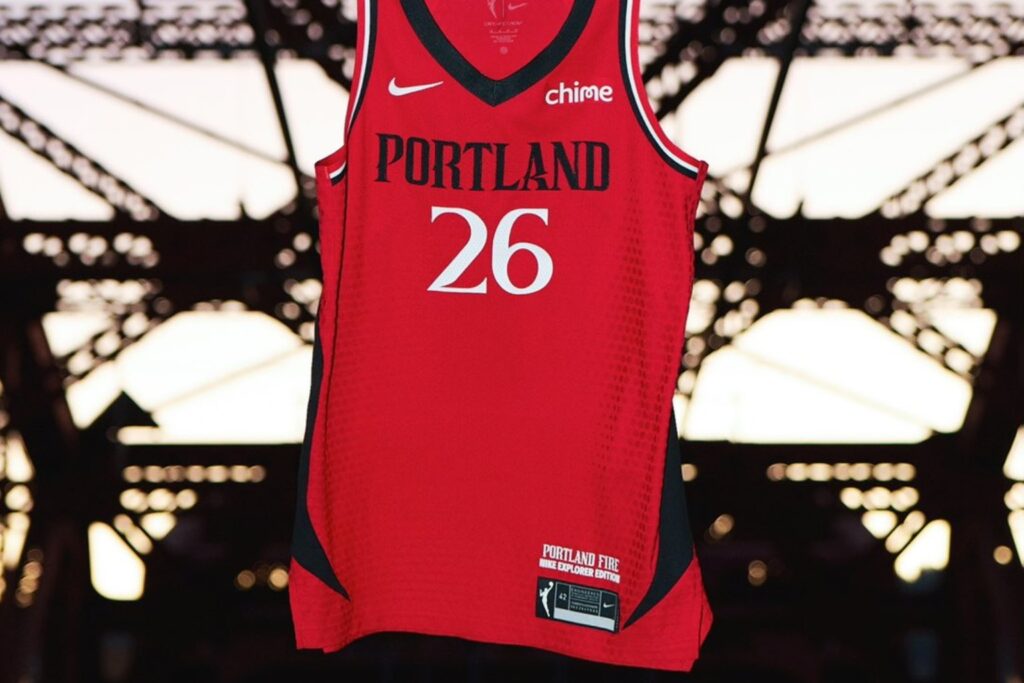
When the league declared its schedule, the expansion team used a unique campaign, reuniting Portlandia Stars Fred Armisen & Carrie Brownstein. The jersey reveal was comparatively a normal process, as the franchise showcased its Nike Heroine Edition, a white jersey with “Fire” across the front, and the WNBA Nike Explorer Edition, a red jersey.
Portland Fire senior vice president Kimberly Veale said, “Our 2026 jerseys are an embodiment this new era of the team: bold, innovative, and resilient. Every element was shaped with Portland in mind, honoring our legacy, while capturing the spirit and energy of this incredible city we represent. As we prepare for our debut season in May, our athletes, and fans alike, will embody that ethos when wearing a Fire jersey.”
FIRST LOOK: The Portland Fire’s home & away uniforms for the franchise’s upcoming return to the WNBA.
— Nick DePaula (@NickDePaula) January 28, 2026
The side tape design on each jersey draws inspiration from the flow of the Willamette River. pic.twitter.com/NtM2afLXS6
The franchise already declared Chime as its Jersey sponsor. Fans react to the jersey reveal, giving mixed responses over both editions.
Scroll to continue reading
Trending WNBA News


A fan wrote, “I’m very confused on the team colors.”
i’m very confused on the team colors… is it red white and black or red brown and baby blue
— roe (@roemelloreyes) January 28, 2026
Another fan said, “So fire.”
So fire
— Chief Rocka (@big_plate_guy) January 28, 2026
One fan mentioned, “The red is (Fire emoji).”
The red is 🔥
— Elizabeth Broussard (@broussard52) January 28, 2026
Another fan added, “Calling it the “heroine edition” in Portland is WILD.”
Calling it the “heroine edition” in Portland is WILD
— Tom Byrnes (@Tbyrnes2) January 28, 2026
A fan commented, “Bland as hell.”
Bland as hell
— Patches 🇺🇸 (@PatchesMatches2) January 28, 2026
The team hinted at a third jersey for the 2026 season, which has not yet been released, but the franchise revealed its alternate logo.
Portland Fire Comes Up With Alternate Logo
Portland Fire will enter the league with two logos, and recently revealed its alternate logo – PDX. According to the Portland Fire, the “P” in the logo highlights a nod to Mt. Hood, and the swooshing right side of the “P” is a subtle rose shape for the ‘W’ side of the NBA.
Rooted in the city.
— Portland Fire (@theportlandfire) January 28, 2026
Designed for the future.
This is Portland Fire
Details threaded below ⬇️ pic.twitter.com/btW1NWHHEW
Then there is a rounded space between the “P” and the “D”. It is specifically for the flow of the Willamette River. The “X” mixes a side with a serif and a side without a serif. As per the front office, the design is to celebrate the conviction, pride and individual expression of Portland.”